Wednesday, 3 July 2013

The Myth of Yellow overlays and Glasses for dyslexic adults?

The issue of ‘yellow’ overlays is associated, I think with the idea that ‘ it makes the text stand out’.
The fovea really only has red and green sensitive cells in it.  The Blue sensitive cells are just not there.  You can argue that a person will always respond to a small yellow component in a visual scene. ( exploited by wasps and poisonous ‘beasties’  warning you ‘ not to touch’!  Basically any ‘yellow (red/green cell stimulating) object on a scene will elicit a saccade to it so that you can
  • ·        work out where it is.
  • ·         examine it.
  • ·          avoid it.

Car rear number plates are black and yellow for that purpose ..sort of!
Lawyers I believe use yellow paper often.. Possibly for the idea of a ‘quick’ read as well.

John’s ( Stein)  work on magnocellular difference ( deficit)shows a connection between blue light stimulating the magnocellular system through the blue/yellow channel and some other cells in the retina has supported the ‘idea that yellow or Blue is ‘good’ for dyslexic people and especially with his glasses from the DRT.
However in discussions with him at the Oxford Symposium, he was happy to point out that because of the pupil reflex the glasses also either decreased the red component or increased it relative to the green which made my ideas and his much closer than he had realised!

The ‘’yellow’ idea also can affect the way that the Intuitive colorimeter has been used. When I was working in collaboration with the IOO and collaborating with Cerium Visual technologies around 12 years ago, we used to send students off to a particular Hospital optometry department where they were using the Intuitive colorimeter, when following the protocols in force, it had become clear that there was a ‘definite benefit’ for the student.
Ok the rule was that ‘ the glasses colour would not be the same as the overlay that the student had chosen  by the forced choice system protocols’ of the Intuitive Overlays from the IOO.
BUT at the time we were the only people actually measuring the benefit of interventions.  I always try to ensure  proper audit.  The students came back with the coloured glasses and we compared their performance with them compared with the overlays and the coloured computer screen.
This particular leading hospital suddenly started to send everyone back with yellow glasses. The students got very little benefit from them.
I followed up with conversation with the quality control people at Cerium, where the glasses were being made.
No one there had noticed any change, there was no auditing system in place. When I checked with the hospital, it turned out that the person trained to use the Intuitive Colorimeter had moved on and a new person was now in charge of it. They had never been on the course with Cerium and thought that ‘Yellow was good for dyslexics’ and had effectively been guiding the students!

There is a tendency to use ‘cream’ or buff as well but this  is likely to be just about reducing the luminance down to around 80% which is you look at the data we have collected appears to be the modal luminance for the thousands of dyslexic students my colleagues have worked with.

There is no data  supports the ‘colour’ cream as being better than any other ’pastel shade’ it has just become a bit of an accepted myth propagated by many websites that give it as a default,

One of the problems of these myths is that because most people/students do not respond positively to them there are loads of false negatives and as a result nobody actually looks for what might work in a logical fashion. This leaves many ‘coping’ with avoidable visual problems, small visual attention spans and reinforces the idea ‘ that you have to live with your problems’

Friday, 28 June 2013

Font size. Such an easy starting point to reduce barriers to reading. Critical Print Size

Font size.  Such an easy starting point to reduce barriers to reading. Critical Print Size

Yesterday I met the daughter of a friend who I taught with years ago. She always had difficulties in school, which were ‘diagnosed’ as Dyslexia when she went to the local FE College.

No one at school suggested that she may have a barrier to reading that could be reduced or removed.

The conversation which took place went over her experiences as a person growing up with dyslexia and how she was ‘assisted’.

She recounted how her difficulties got worse when she started in secondary school.  The drop in font size was a real problem for her. So much so that at the age of 12 she went to an optician where she was identified as significantly short sighted with an astigmatism in both eyes.

In secondary school, she did not like practical work which involved reading instructions or writing. She was very messy or clumsy if she mixed the practical work with reading and writing. This is a very typical story that I hear from adult dyslexic people.  Where possible she would work in a team and leave the reading and writing to other members of the team…. No problems then.

This did not solve her problem though.  In a way it must have reinforced in her the idea that she just was not really academic. The optician could not fix her problem.   She was still very aware that the reading was really limited by the small font sizes being offered to her, in all the books and print outs.

With smaller fonts the letters seemed to crowd each other, especially the ends of the words, which she would guess at. After a short period of slow reading the letters and lines would start to move, become unstable.

At the FE College, she was referred to an Educational Psychologist, who duly tested her and pronounced her ‘dyslexic’. Unfortunately, she was unable to read the ‘report’ and did not understand the ideas when explained to her.  This is a common experience of dyslexic undergraduates.  It is often as if they do not recognise the report as really being about them.

Back to my friend’s daughter. 
At the college the support staff went through ‘testing for ‘colour’. A range of ‘coloured plastic sheets’ were placed on to text.
Some stabilised the text for a short time, then the movement and crowding would start again. She has a ‘bluish filter’ which sort of helps sometimes.  But a larger font always does!

I am writing this today, after a few weeks without a blog following a spinal problem which has made it difficult to use my computer, because yesterday I received an email from a group of dyslexia specialists which I am a member of which included a link to a particular website.

Now the people who run this website are great people, I have tremendous respect for them. I have tried to engage them in a dialogue, but just get ignored. Perhaps they know something about me that I do not. Let’s consider the website, please look at it as you read this.

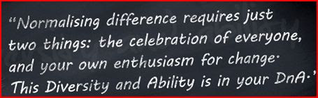
The first thing that hits you is the bit of graphics on the home page with the philosophy of the two main people at DNA and amongst others, that well respected ‘honourable /co-opted dyslexic Albert Einstein.


Now this is a good start.  Large font, not a white background.

Then we get into body of the website.

Welcome to DnA, a social enterprise story
designed and led by dyslexic and disabled
 adults working with the sole purpose to
 provide support, strategies, Assistive
 Technology training and shared wellbeing.
The website appears to be defaulted to Arial 10.5 font.  From work with dyslexic undergraduates in the UK the following histogram has been produced showing the ‘optimum font size, needed to stop the dyslexic student’s reading performance being limited by font size.


Ignore the pretty colours but look at the column on the left. 

There were 3 students who had a critical font (print size) less than 11!

In this histogram of the last 345 dyslexic students seen by my colleague, 99% would be restricted by the font size on the website.

Over half of them needed a font size of 16. They would still be restricted if the default was font 16.

This is in no way a new idea. Other studies have found a close relationship between font size and reading performance. One report suggested that font size management is a major reason for the popularity of Kindles, in addition to that lovely grey background.

In work being undertaken with a primary school, font size is the starting point in reducing barriers to reading. You can see a close link between oral reading fluency and critical print size. An adjustment that could be made in all printed materials at the school and in extreme cases using a computer screen.

I will publish this in Font 20 as well. There are issues in terms of restricting the space for advertising on the web… sorry to you graphics artists.

Back to the website.

Taking our cue from the expressed philosophy let’s consider accessibility. How can the user of the website reduce the barriers for themselves?
There is an accessibility option at the top of the site.  This gives the opportunity to raise the font to a massive Font 12!!!!!


Welcome to DnA, a social enterprise
 story designed and led by dyslexic and
 disabled adults working with the sole
 purpose to provide support, strategies,
Assistive Technology training and
 shared wellbeing.
                                                    
Ok that fantastic possibility will now bring improved access to…
..another 7% …..of the dyslexic adults reading this site, leaving another 92% struggling because of font size.
Mind you they probably think they are struggling because they are dyslexic!
I will quote someone who, on the occasions when I talked with him gave me great hope about what could be.
Attitude is indeed the biggest disablement. We all have the ability to change the attitude of others. ‘
Unfortunately that ‘attitudes’ that we strike up for ourselves; unwillingness to remove /reduce obvious boundaries restricts our ability to change the attitude in others.


I worked for a few years with a group of inspiring, severely physically disabled young people at Hephaistos School, when I first started teaching. They taught me a great deal.  First remove /reduce the barriers.  

And now at font 20

Font size.  Such an easy starting point to reduce barriers to reading. Critical Print Size

Yesterday I met the daughter of a friend who I taught with years ago. She always had difficulties in school, which were ‘diagnosed’ as Dyslexia when she went to the local FE College.

No one at school suggested that she may have a barrier to reading that could be reduced or removed.
The conversation which took place went over her experiences as a person growing up with dyslexia and how she was ‘assisted’.

She recounted how her difficulties got worse when she started in secondary school.  The drop in font size was a real problem for her. So much so that at the age of 12 she went to an optician where she was identified as significantly short sighted with an astigmatism in both eyes.

In secondary school, she did not like practical work which involved reading instructions or writing. She was very messy or clumsy if she mixed the practical work with reading and writing. This is a very typical story that I hear from adult dyslexic people.  Where possible she would work in a team and leave the reading and writing to other members of the team…. No problems then.

This did not solve her problem though.  In a way it must have reinforced in her the idea that she just was not really academic. The optician could not fix her problem.   She was still though very aware that the reading was really limited by the small font sizes being offered to her, in all the books and print outs.
With smaller fonts the letters seemed to crowd each other, especially the ends of the words, which she would guess at. After a short period of slow reading the letters and lines would start to move, become unstable.

At the FE College, she was referred to an Educational Psychologist, who duly tested her and pronounced her ‘dyslexic’. Unfortunately, she was unable to read the ‘report’ and did not understand the ideas when explained to her.  Again this is a common experience of dyslexic undergraduates.  It is often as if they do not recognise the report as really being about them.
Back to my friend’s daughter.

At the college the support staff went through ‘testing for ‘colour’. A range of ‘coloured plastic sheets’ were placed on to text.

Some stabilised the text for a short time, then the movement and crowding would start again. She has a ‘bluish filter’ which sort of helps sometimes.  But a larger font always does!

I am writing this today, after a few weeks without a blog following a spinal problem which has made it difficult to use my computer, because yesterday I received an email from a group of dyslexia specialists which I am a member of which included a link to a particular website.


Now the people who run this website are great people, I have tremendous respect for them. I have tried to engage them in a dialogue, but just get ignored. Perhaps they know something about me that I do not. Let’s consider the website, please look at it as you read this.

The first thing that hits you is the bit of graphics on the home page with the philosophy of the two main people at DNA and amongst others, that well respected ‘honourable /co-opted dyslexic Albert Einstein.


Now this is a good start.  Large font, not a white background.

Then we get into body of the website.

Welcome to DnA, a social enterprise story
designed and led by dyslexic and disabled
 adults working with the sole purpose to
 provide support, strategies, Assistive
 Technology training and shared wellbeing.
The website appears to be defaulted to Arial 10.5 font.  From work with dyslexic undergraduates in the UK the following histogram has been produced showing the ‘optimum font size, needed to stop the dyslexic student’s reading performance being limited by font size.


Ignore the pretty colours but look at the column on the left.  There were 3 students who had a critical font (print size) less than 11!

In this histogram of the last 345 dyslexic students seen by my colleague, 99% would be restricted by the font size on the website.

Over half of them needed a font size of 16. They would still be restricted if the default was font 16.

This is in no way a new idea. Other studies have found a close relationship between font size and reading performance. One report suggested that font size management is a major reason for the popularity of Kindles, in addition to that lovely grey background.
In work being undertaken with a primary school, font size is the starting point in reducing barriers to reading. 

You can see a close link between oral reading fluency and critical print size.  An adjustment that could be made in all printed materials at the school and in extreme cases using a computer screen.

I will publish this in Font 20 as well. There are issues in terms of restricting the space for advertising on the web… sorry to you graphics artists.

Back to the website.

Taking our cue from the expressed philosophy let’s consider accessibility. How can the user of the website reduce the barriers for themselves?
There is an accessibility option at the top of the site.  This gives the opportunity to raise the font to a massive Font 12!!!!!


Welcome to DnA, a social enterprise
 story designed and led by dyslexic and
 disabled adults working with the sole
 purpose to provide support, strategies,
Assistive Technology training and
 shared wellbeing.
                                
Ok that fantastic possibility will now bring improved access to…
..another 7% …..of the dyslexic adults reading this site, leaving another 92% struggling because of font size.

Mind you they probably think they are struggling because they are dyslexic!

I will quote someone who, on the occasions when I talked with him gave me great hope about what could be.

Attitude is indeed the biggest disablement. We all have the ability to change the attitude of others. ‘
Unfortunately that ‘attitudes’ that we strike up for ourselves; unwillingness to remove /reduce obvious boundaries restricts our ability to change the attitude in others.

I worked for a few years with a group of inspiring, severely physically disabled young people at Hephaistos School, when I first started teaching. They taught me a great deal.  First remove /reduce the barriers.

Monday, 3 June 2013

Dyslexia, Reading fluency, Colour, parafoveal processing and logic


This weekend I was talking with a relative who is also a teacher.  She told me that the new school she is working at was using colour overlays to help the pupils.

The school has a high proportion of students with ‘Special educational needs’.
They are aiming to get around 90% of their pupils into the 5+ GCSE grades ABC.  
 
Most SEN pupils have relatively low reading speeds, and there are good arguments to think that the low reading speeds are really about limited visual attention span, the number of letters that can be processed in parallel as they read. (see previous posts) or the number of milliseconds it takes to compute  the visual data this block of letters and others that are in the parafovea; how many letter can be processed within affixation…the perceptual span.

If this is true, and it is looking increasingly certain as more research comes out, then the gains that are experienced when using a coloured filter, has to be caused by.
  1. A decrease in the retinal data compute time … increased data transfer rate per millisecond
  2. Better spatial and temporal data integration as the ‘lines’ or edges’ move across the centre-surround arrangement of the cone cells of the retina; leading to reduced crowding effects.

Research into this is totally possible, but I do not have the resources. All published research seems to treat 'colour' as anything other than white or grey.

Usually 'red' , 'green',  'blue'  or yellow. With no real thought about the biochemistry of pigments and the metrics of pigment bleaching in the cone cells or the edge detection process.


My own work tells me that it is not actually really about ‘colour’ anyway.  Unfortunately, it requires a different mindset about ‘colour’ than appears to be dominant.

The filters that most schools use are from a very restricted palette. For example there is one cyan usually.  Cyan is not really a colour. It is what is perceived when the red cone stimulation is reduced compared with the green cone cells.

About half the population tested by my colleagues and me (from a sample of around 12,000) actually benefit from the use of ‘a cyan’.

But there are thousands of ‘cyans’; If the filter takes out too much red then it may be worse than a white background.

There may be other limiting factors not checked properly.

  • It may be that unless the font size is big enough, then the changing the amount of red will have no effect. It is not the controlling factor.

  • It may be that the ambient lighting is too bright and again the Cyan filter will have no effect.

  • Perhaps they need ophthalmic glasses first  to get any benefit.


The danger is that many young people at this school and other colleges and universities, will actually get minimal or no benefit when they could have got a great deal by teachers/schools/support staff not really understanding what they are doing.


A few will gain a great deal, and will be what spurs people on to use this very ‘cheap’ approach. Many, the majority, will get a ‘false negative’ and will have their failures reinforced.

 This costs them and our country a fortune unnecessarily.  The false negatives, and minimal benefits  that most children get is actually very expensive.

Saturday, 25 May 2013

A very important research article concerning the relationship between perceptual span and reading rate in adults.

This article by a team led by Keith Rayner, one of the world's leading researchers in this field, should be read by all seriously involved in working with dyslexic adults and anyone interested in how we read.

As in most research into reading, this looks at the reading performance of effective ‘fluent readers’. But it again reinforces the need for maximal parafoveal processing. Being able to process visually and hence phonologically, the characters in the direction you are reading.

The article refers to ‘fast’ and ‘slow’ readers.

The fast readers (reading over 258 wpm, with an average reading rate of 337 wpm with normally spaced fonts)

The slow readers (reading less than 258 wpm, with an average reading rate of 207 wpm with normally spaced fonts).

These must have been silent reading speeds, with I believe, most of the slow reading groups sub vocalising.

The slow reading group were unable to use of visual data more than one extra word in the direction of reading. Whereas the fast reading group were able to make use of 2, 3 or more words ahead.

Read the article. The evidence is very supportive of the model being developed here, which is mainly based on working for adults reading at an average speed of 134 words per minute, and very rarely over 160 words per minute. (See the previous post).

Think again about  of the relevance of particular numbers. 

For the slow readers, when they could only see the word they were reading,with no parafoveal visual information their mean reading speed dropped to that 160wpm again.  

For years, I used to have the number written large the wall where I was working. It always intrigued me.  So......
.......160 wpm is the mean reading speed if you can only visually/phonologically process one word at a time.

The majority of dyslexic adults, typically cannot process a whole word in one fixation. Research referred to in previous postssuggests this is likely to be associate to some extent with lack of phonological cues from parafoveal processing.

At least with the way text is usually presented.

An easy (and free way) way of finding out if you, your child,your friend or your student is likely to be diagnosed as dyslexic.


  1. The good reader sits beside the person to be checked, so that they both can see the printed body of text.
  2. The printed text is laid flat on a table.
  3. The person thought to be dyslexic reads aloud to the good reader.
  4. After approximately about 20 seconds, the good reader, as they hear a word being read places a finger across the next word to be read.

A reader who experiences difficulties, likely to be diagnosed as dyslexic, will stop reading.

Fluent readers will continue reading; they will already have visually and phonologically processed the covered word.

A really fluent reader will probably continue even if you cover up several of the words ahead of the one just heard.

All up to date models of reading, looking at the relationship between, linguistics, eyetracking  and reading performance, incorporate what is referred to as ‘word skipping’. This is the way in which the eyes do not have to bring every word to focus on the fovea in order to process it. But really this is about good, fluent readers.
 
The studies on which the models are based usually use data collected from fluently reading undergraduates, or occasionally fluently reading children.
When you look at eye tracking data, each eye fixation appears to take on average between 240ms and 300ms. (Between 3 and 4 per second)

When you measure reading aloud speed in adults, the mean for undergraduates is around 184 words per minute (this is also a clear mode). In my work this appears to be independent of what the words are. Random word sequences produce the same output and even random digit sequences. This was also found by Uta frith in her work with undergraduates at University College London. So I am in good company!

This is then quite a fundamental, important value.

But when this same group of people are reading silently, commonly people read around 480 words per minute ( this is a clear mode). BUT  the fixations still take the same amount of time. 2 to 3 words are being seen and processed in each fixation.


Another mode for reading aloud by adults is c160 words per minute. Many people who read aloud at around this speed also read silently at this speed.
This is all very mechanistic, there are mathematical patterns around. Wherever you find patterns in science, there has to be reasons, causation for the patterns.

The posts on visual crowding, parafoveal processing and parallel processing of visual data are all mechanistic biology helping to make sense of these patterns.

The post about musicians is highly pertinent. 
The fluent sight reading pianist turns the page well ahead of playing the notes on the page being turned.

The fluently reading teacher appears to be hardly glancing at the book as they read aloud to the children.


When we improve the processing of parafoveal and even peripheral visual data, by modifying its appearance, then we get more fluent phonological output.

Would covering up the next word still stop them reading?

Thursday, 23 May 2013

Parafoveal data collected during the ‘lexical access period’ (L1) of a word enables the phonological processing of the subsequent word.


Parafoveal data collected during the ‘lexical access period’ (L1) of a word enables the phonological processing of the subsequent word.

I have just read an article, the Urll is given below which is very supportive of the ideas developing in this blog.

Please read the article and if my interpretation is not correct please let me know.


The results suggest that the activation of phonological codes is a very early component of reading.

Suggests that phonological codes are associated with L1  time period.

So parafoveal data collected during the ‘lexical access period’ (L1)enables phonological processing which then enables the subsequent phonological processing of the following word, improving the ‘legibility’ ( Visual attention span increase)

This should enable faster fluent reading.

Any reduction of crowding in the parafoveal region should increase reading fluency with knock on effects on working memory/central executive.

This is of very great significance in the enjoyment and effectiveness of reading.  

Of major importance with adults who seem to have reached a limit totheir reading performance and are frustrated.

Tuesday, 21 May 2013

Why do dyslexic adults get so easily distracted especially when reading? Are they ADD or ADHD?


Why do dyslexic adults get so easily distracted especially when reading? Are they ADD or ADHD?

Three years ago I posted on the blog about the issue of ADD/AHDD

I have reposted it because, it is still very relevant and I believe should be read by more people.  Since then there has been a huge increase in the number of you reading the blog. You will have can see many graphs showing the binocular eye movements during reading in my other posts.
I hope this makes sense.
If it does, then please retweet the tweet you received informing you of this post. Thanks.
>>>>>> 
The other day, I met a little boy, 5 years old. He has been placed on medication after his school wanted to expel him. He has been diagnosed as ADD or ADHD.

Not sure which but one or the other. Taking the medication is the condition of his continuing in school.

He gave me a picture he had drawn; now framed and on my wall.
Ok. The medication leaves him calmer. But is that the only way? Why is he so easily distracted?

One of the characteristics of so many people when they are reading, is that one eye turns away from the page and ‘often gazes out of the window’ or goes ‘on patrol’ searching the environment for something that might need to be looked at…studied….checked out.

My Binocular Eyetracker shows me this eye turn happening with many dyslexic students, many of whom find concentrating when they are reading, extremely difficult. The dyslexic person does not 'feel the eye turn' although many do get eye aches associated with it after a few minutes of reading. This build up appears to be associated with reading stamina problems.

These students do not realise why, but if anything around them moves they stop seeing the words and instead, find themselves looking at whatever is moving! Or they turn their heads towards a new noise.

It was not until I was in Posnan, Poland, with the professor who was the developer of the Binocular Eyetracker that this all seemed to make sense.

He had a very simple way of demonstrating what was going on.
He used a ‘binocular viewer’, the old plastic ones where you looked at two very similar photographs, through two lenses, one for each eye. The two slightly different photos looked at like this gave you a 3-D image. Great fun in the 1950’s!

Professor Ober used an adjusted pair of photographs. One was a picture of an elaborate throne room in a castle. The other was a blank cyan (bluish) square.

When you looked through the viewer you only ‘saw’ the elaborate throne room, all reds and gold. Your brain completely ignores the cyan image. It suppresses it.

But he had adjusted the viewer in another way. In front of the cyan side was a tiny piece of wire. Which he could move as you viewed. When he did this your brain immediately switches attention to the blue side. You stop seeing the throne! After several seconds your brain ‘decides that the cyan is not interesting. ‘That eye is sort of switched off’ and your brain gives attention again to the throne!

Using the Eyetracker, you can see that the eye looking around the throne and the eye looking at the cyan were not looking at the same part of the two pictures. The eye looking at the cyan, has turned sideways slightly.

But as soon as the wire is moved, BOTH eyes move (called a saccade) move to the part of the picture where the wire has moved. It brings it to ‘centre stage’ focussed on your fovea or yellow spot. (The part of your retina which has the most ‘megapixels’ per square millimetre.)

Now if an eye us turned away from the target words, this is a reflex beyond your control. It is what we have evolved to do. It protects us from ‘dangerous things around us while we are concentrating. BUT when you are reading or concentrating for a long time it can cause great problems and in schools is seen as a fault. It is disruptive to others.

So let's return to the little boy. He has severe focussing problems; one eye is different to the other. He is very long sighted. He loves his glasses now he has them. They allow him to concentrate.

Many of the dyslexic adults I have seen have an eye which has been suppressed, often the eye needed but was not corrected by lenses when they were at school, in addition they were often very light sensitive and going with it ..Very easily distracted… With the reflex action described above, that is not really surprising!